
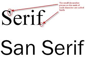
Let’s learn a bit about fonts. There are two main categories of fonts: serif fonts and sans-serif fonts. Serif fonts have small lines attached to the end of the characters, like a small tail or stroke, that give it a bit more flair. Sans-serif is a simpler, cleaner font without any extra added strokes.
While sans-serif is a bit more common, both can reasonably be used in websites. Which you choose depends on the style you are aiming for, your audience and personal preference.
The world of web design is constantly changing and how fonts are handled on websites has made some broad strides in recent times. In order for a font to be used on a website, the font needs to be installed on the viewer’s computer or installed within the website. In previous years, installing on the website was labor intensive and unreliable. Generally, you were limited to a small set of fonts that were installed by default on most computers.
Google Fonts has completely changed this, making it simple to install as well as a lightweight for the user to download. This busts open wide the world of fonts you can choose. Click here to take a look at some of the fonts that google allows you to easily install to your website.
Handwriting fonts, whimsical fonts, calligraphy fonts, character based fonts, geometrical fonts: the choices can seem endless. You can choose the spacing between letters, the slant, the thickness of the stroke. So which font should you use for your website?
Every web developer is going to have a different opinion on this. So instead of giving you my opinion, I’m going to give you a few guidelines to help you choose the best font for your business. Keep in mind, that when it comes down to it, there are many good fonts and sometimes it comes down to personal preference.
Readability
Readability, readability, readability. I can’t stress this enough. Never should the choice of font or style come at the price of readability. The quickest way to lose visitors is to make the website difficult to use. Keep in mind that your viewers will have different screen sizes, different resolutions, can change the size of the font rendering, even different colors! Your font choice should be clear and legible in various sizes or colors.
While more creative or unique fonts can be used for accents, the base font should be something basic. Generally, you should have no more than 3 fonts per website. Too many fonts will be confusing for your viewer and the lack of consistency gives an image of lack of stability. As with all design, your fonts should be consistent and not overpowering. They should add to the design but never detract.
Style
Just like colors or graphics, your font set is part of your overall branding and can be a part of presenting a message about your business. What message are you trying to portray? In my experience, things like banks or financial organizations tend to choose serif fonts. The formality of serif fonts adds a bit of extra seriousness and security. Organizations such as schools or teaching based sites use sans-serif fonts, helping to bring the message of “putting the cookies on the lower shelf”. More whimsical fonts are common on artistic or creative sites. Fancier fonts also can portray the message of skill and effort.
Ask yourself a few questions.
Are you trying to present an image of fun and flavor or stability and trustworthiness?
Function or fashion? Are you viewers coming for fun or do they have a task to complete and then get out?
What style is your current branding and what fonts would support that?
Still with me? Now that you know some guidelines for choosing a font, the rest is personal preference. I’d also like to add that it can be counterproductive to over think it. First and foremost, you want a font that is readable and portrays your message. Function over fashion. Keep that in mind and the rest will fall into place.


